The landing page checklist that doubled a client's leads
Ananya Kapoor · Head of Design5 min read
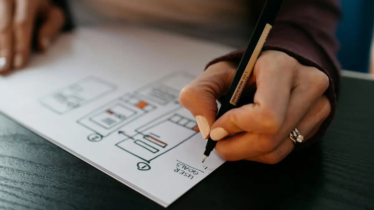
Before we let a client spend on ads, the landing page gets checked against this list. On one interiors client, working through it took the conversion rate from 1.9% to 4.1% — the ad account was never the problem.
Above the fold
The headline states the outcome, not the company. "Modular kitchens installed in 30 days" beats "Welcome to our website".
It matches the ad. If the ad said "same-day repair", those words appear on the page. Mismatch is the fastest way to lose a click you paid for.
One primary action, visible without scrolling. Not four competing buttons.
A phone number that is tappable on mobile. Many buyers want to call, not fill in a form.
Proof within the first screen. A rating, a client count, a recognisable logo.
The body
Answers the three objections that lose you sales. You know what they are — price, timeline, and whether you will disappear afterwards. Address them explicitly.
Specific numbers instead of adjectives. "Installed in 30 days" not "fast turnaround".
Real photos of real work. Stock photography measurably reduces trust.
Testimonials with a name, role and result. An anonymous quote persuades nobody.
Scannable structure. Short paragraphs, real subheadings. Nobody reads a wall of text on a phone.
The form
Ask for the minimum. Every additional field costs conversions. Name, phone, and one open question is usually enough — you can qualify on the call.
Say what happens next. "We will call you within 2 working hours" outperforms "Submit" consistently.
Errors appear inline, and typed data survives them. Wiping a filled form on a validation error loses the lead outright.
The thank-you state is a real page. Confirm what happens next, and give them something to do while they wait.
How to use this
Open your own landing page on your phone, on mobile data rather than office wifi, and go through the list honestly. Most people find four or five failures in ten minutes.
Fix those before increasing ad spend. Improving conversion rate from 2% to 4% is the same as doubling your budget, except it costs nothing every month afterwards.
Ananya Kapoor
Head of Design at Corewebbers, New Delhi.
Leads UI/UX and design systems. Ex-product designer at a Gurugram fintech.
Most chatbot projects fail for boring reasons: the wrong use case, no guardrails on pricing, and nobody reading the transcripts. What we have learned launching AI assistants on WhatsApp for clinics, coaching institutes and D2C brands.
A plain-English comparison for owners running production on Excel and Tally. When an off-the-shelf ERP is the right answer, when a custom build pays for itself, and the questions to ask before you sign anything.
UPI, COD, GST invoices, Shiprocket and sale-day traffic change the answer for Indian brands. How we pick a platform for D2C and B2B stores, with real costs and trade-offs.